
You must log in or register to comment.
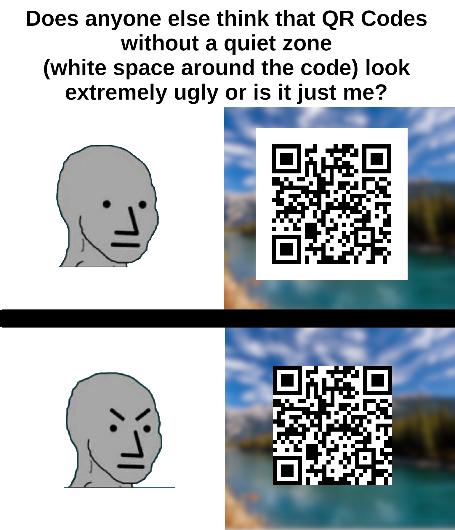
I think that the white space is actually part of the protocol?
It is.
I am watching veritasium last vid on how qr codes work as we speak
Lol this exact video is what prompted me to make the meme
It’s required for contrast detection.
Also, if it was placed on something with a black background, the borders would bleed into the background and be unrecognizable when scanning.
This is why graphic artists don’t get to determine functional standards.
The error correction isn’t enough to overcome a bad background?
My memories of the early days of designing these things for ad clients (we’re talking 2010-11) were that like 20% “damage” was allowed before scanning became difficult. So of course my art director wanted to put cutesy shit all over them to be “unique”.
I just didn’t want the client to ask when it didn’t work because their phones didn’t like them.
People like your art director are the reason people like my product manager want us to write code to verify QR codes, so that our clients can tell their clients that they forgot the quiet zone and their client’s clients may have trouble reading the code.
Damn that’s a lot of levels of clients.
Error correction helps a scanner account for portions of the code being obscured/unreadable, whereas a bad background can make a code not even recognizable as a code in the first place. (depending on the algorithm used, how bad it is, yadda yadda)
I helped my wife make a qr code quilt (it says “quilt”). There wasn’t quite enough border around it, and you can get it to scan, but it’s not super reliable.
It is - without the quiet zone, it makes detecting the locator pattern really difficult, especially in one’s looking for the 1:1:3:1:1 ratio.
I spent 20 years in graphic design shit and wish I’d thought of something as cool as “quiet zone”.
I’ve seen at least one company press kit in rules on how to display their logo refer to it as “respect distance”.
I’ve usually used “clear space” because that’s common with spaces around logos but i like respect distance. though I don’t know what people in general would think of it after social distancing being associated with a terrible period of our lives.
Not quite the same but “bleed” is pretty cool!
Personally I’m going to start saying “quiet zone” instead white space. I’ll probably get dumb looks anyway.
It’s not just ugly, it’s against the spec. The quiet zone is meant to be 4 “dots” wide on all sides for the code to be optimally readable.
You can’t circumcise the QR code man!
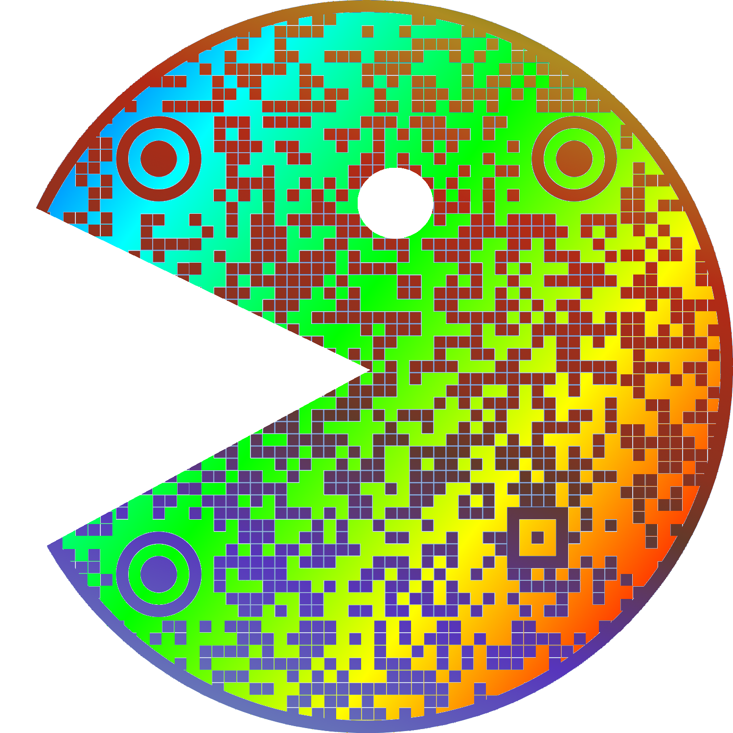
Does it really scan when both timing patterns (zebra stripes between the three corner “squares”) are interrupted?
Edit: Not even Google Lens can scan it. (Edit edit: worked fine with screenshot.) Next time, avoid the red regions when putting logos etc. on mid-size (3+1 “squares”) QR codes:
🟥🟥🟥🟥
🟥🟩🟩🟩
🟥🟩🟩🟩
🟥🟩🟩🟥You can rotate the code of course but not flip it.
I recommend using a dedicated qr scanner instead of google lens, because even if it can scan qr codes, it isn’t optimised for it. Sometimes it can’t even detect a medium-sized qr code in a screenshot, and it looks like they haven’t even implemented the full standard.
Here’s a pretty good qr-reader I can recommend: https://play.google.com/store/apps/details?id=com.blogspot.aeioulabs.barcode
Not open source, which is a red flag for me. There are QR scanner&generator apps on F-Droid, and you can check the source code that they do NOT send the scan result to some server and do NOT sneakily take a pic of you with the front camera.
Here is what you should do for security around QR codes.
In cases when privacy isn’t important (here, Google can match my Google and Lemmy usernames, and I leave a public comment), you can use Google Lens (in browser!) and crop the area of focus, and unlike most QR readers that only apply a linear transform (perspective correction), it works for QR codes on bent surfaces.
I have been using the one I use for 10 years, but the one you sent looks pretty good too. Being open source is a green flag for me too, when I started using mine there were no good open-source qr-readers, that’s why I went with this one.
I’m not sure if a hardware barcode scanner would like it but Google Lens can read it just fine.
Google Lens is indeed one of the best, and it failed for me with direct image upload (incl. transparency). It worked with a screenshot so maybe the size threw it off.
Not even Google Lens can scan it
Might be you, I just used lens to check the QR code man and it detected it just fine on my pixel 8.
I like your username
Cursed image
everything is. whitespace is an important part of graphic design, especially margins. think about text that’s too close to the edge is the page or screen.
especially margins
Since it has the background color of the QR code, it’s probably padding, not margin.
^someone please rescue me from frontend dev^
Here here, have some Chai. Take a break and
everything.should.be.okEdit: I’ve been free from web dev too long and it shows. Don’t even know my assertions anymore.
i was speaking generally, which is why I mentioned pages as well as screens. that’s more of a web design distinction; never really heard of padding in any other context.
but if you were to have a qr code on your website, you’re right, making it padding would make more sense since the border, real or imaginary, would be outside the quiet zone because it’s technically part of the code.
that’s more of a web design distinction
I think that was the point of “someone rescue me from frontend dev” - if they’re doing so much frontend design work that they instinctively get pedantic about padding vs. margin, they need help.
yeah I know, but that’s still information out there and if anyone’s reading it’s nice to clarify. I both clarified and situationally agreed with them.
It is now. That’s the beauty of art.
did you mean to reply to something else?
Hm, it was supposed to be indeed. It was the comment about the meme format
It’s the same with text.
the bottom one is not a qr code. The padding is part of it.
Yes, the Quiet Zone is part of the QR spec.
But the bottom one is still a QR code, it’s just an out-of-spec QR code. Most QR readers will still process it just fine, but there’s greater room for error depending on what surrounds the code itself.
padding
Found the developer
Everyone must submit to the CSS box model!
i hate coding for browsers. To that end, I do not actually know css. I just called it padding when I wrote my own qr code library, because it was easier to say than “quiet zone”.
Just like “dots” or “pixels” are easier to say than “modules”
Yeah… I’m pretty sure the white space is part of the spec for a QR code.
My current bugbear with QR codes is that lots of folks have started putting their company logo in the middle of the code.
Sure it still works but it makes the error correction work harder so your users need to be nearer or have better cameras than they would otherwise. Annoying.
I hate that so much. Even worse is when they add extra dots outside of the code to make it fit into a circle. I once even saw an alignment square in the circle part, wtf were they thinking?
I mean you could also increase the error correction rate without increasing the company logo size.
deleted by creator
Is it a Rick Roll? It’s a Rick Roll, isn’t it?
checks anyway
Yep.

Hey, I use the same QR scanner app!
For anyone else interested, it’s called “QR Scanner” by SECUSO
you should check if the following link is the one you expected
Yup, it’s what I expected, all right.
Surprise, it’s a Rick Roll after all!
I just wanna tell you how I’m feeling, gotta make you, understand
I feel like scanner apps should have a special check for that specific url and start playing the song immediately without asking for a confirmation
Oh, it’s not a Rick Roll!
It’s not just ugly, they don’t scan properly. I’ve had this problem many times on codes without padding because my email client or browser was set to use a dark theme.
It often goes unnoticed because most people are using a white or clear background that gives enough contrast.
Second one feels naked
uwu
whats this?
I’ve never given it a single thought.
I’m also bothered by very detailed QR codes. Milk cartons in my country had a QR-code for their website. It would be a ~10 letter url, maybe with a short path. But for some reason, the QR code was extremely detailed, as if it contained several kilobytes of data. I’m not sure if there were a large number of tracking-related parameters in the url, but it was very obviously unreasonably large.
Strongly agree on this one. Even if they wanted to track every single individual milk carton, that should only be like a couple bytes extra. Overly complex QR codes look ugly and are harder to scan
The complexity is likely a product of redundancy and error correction in the QR code rather than making it unique. You begin to run into issues with camera resolution and whatnot, but in theory those codes are likely more reliable.
QR codes have built in redundancy and error correction, though. I guess if they had it turned up to the max for some reason?
Yeah - that’d be my guess for an over-complicated code with minimal info.
yeah, qr codes have different levels of error correction that you can specify, could very be well turned up to the max
or the url has a ton of tracking params appended to it for some reason
or the url has a ton of tracking params appended to it for some reason
Ideally you should use a short URL that redirects to the full URL. The tracking parameters should be on the long URL, not the short one.
Why is that ideal? Seems more prone to problems if the short URL service shuts down or suffers outages.
You don’t have to use a third-party short URL service. It can be hosted on your own site.
A lot of people are already using a third-party short URL service like qrco.de because they don’t realise you don’t actually need a service like that to make a QR code.
Scan one and find out
My QR Code Scanner app can recognize Qr codes in all sizes and from many angles but it won’t ever scan the ones without border, like if I’m on dark mode on some websites
That’s because the border is part of the code, otherwise it can’t ‘see’ the three boxes that it uses for orientation.
iPhone can figure it out without the border ¯\_(ツ)_/¯
Its oddly offputting 😂


