I really don’t like the design of the progress pride flag, and I couldn’t really put my finger on it until I saw this: https://nava.org/good-flag-bad-flag
For reference, here is the flag I’m referencing as “bad flag”:

And here is the original:

So, the original has too many colors, but it’s the colors of the rainbow. In order. It’s recognizable from really far away, and it’s dead simple to draw.
With the Intersex flag, that’s 14 colors. There are three shades of “purple”. The circle won’t be visible from far away. The chevrons are too thin to be very recognizable from far away.
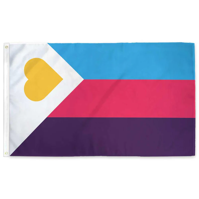
It’s not like there aren’t good pride flags. Like there are AMAZING ones:




Edit:
In case you don’t know what these are: https://flagsforgood.com/collections/pride-flags
I think it’s basically just “feature creep.” Too many ideas trying to be crammed into one symbol. And what’s annoying, to me, is that the rainbow by itself was already supposed to represent everyone. That’s why it is a rainbow.
It’s the same phenomenon as “LGBTQI+”
It was literally LGB at one point. I understand the concept of inclusion but I think pursuing it by appending and appending and appending is a lousy way to go. I believe the “Q” was finally added in part because it was hoped to be some kind of catch-all, but that didn’t work.
I propose reducing it down to QT
You have reached enlightenment. The universe has no more secrets to you, young one.
You know too much.
CATCH THEM, BOYS !

We could always use the GRSM acronym (Gender, Romantic, and Sexual Minorities)
I just learned about GSM two days ago here on Lemmy. Now I am learning about GRSM, and while I like both, learning that there is now an additional letter leads me to believe it may go down the same rabbit hole.
Really? I’ve never heard just GSM.
I’ve gone down the rabbit hole and gsm is apparently a common incorrect way to say it. Also a lot of LGBTQ people dislike the term.
Really? Why?
I’m just hearing it for the first time in this thread but my first impression isn’t great. Do you really want a label that brands you as a “minority?” That doesn’t seem like a great first step toward equality.
Oh shit I unironically like this.
I’m a fan of it but it doesn’t seem widely known. Maybe we should spread the word.
Maybe we should shorten it to Q++ 😅 (j/k)
I guess I would like to schedule a meting with the project manager and/or customer to discuss the flag specification…
Make sure someone takes minutes so we can maximize our synergies and deliverables.
Why is this upvoted so much? Do you know anything about the Pride flag? Each color represented a particular concept (e.g., sex, sunlight, nature). The colors mean something and weren’t just a catch-all concept to “represent everyone.” Like you’re just saying shit lol. The fact that I see this dumbass discourse EVERY YEAR tells me that maybe it’s not just aesthetics that folks are complaining about, I think some people are removedes and don’t wanna make room. The Progress Pride flag is great and makes clear that it really is for everyone, not just gay men. Get over yourself fr.
The original Pride flag was designed with eight colours, but quickly moved to six and seven stripes because of issues with sourcing dyes and mass production. As others have said, each colour did have a specific meaning like Sex, Life, Harmony, Art, Sunlight. These were aspects of the queer community, but they did not mean specific or narrow identities, and did not only describe ‘gay’ or ‘lesbian’ people.
In the words of Gilbert Baker (who designed the initial flag) “We needed something beautiful – something from us, and the rainbow is so perfect because it really fits our diversity in the sense of our race, our gender, all of those things.” Since then people have added specific colours and extra features to draw attention to identities that they felt were undervalued or overlooked, which is laudable goal, but not because the original did not include everyone.
You’re throwing around a lot of strong negative claims about the discussion here, if you really want to make a case that the meaning of original flag did not include queer people who were black or whatever, please bring some sources. And just to note, personally I actually like the chevrons of the Progress flag, but that doesn’t invalidate people claiming that the original flag included everyone.
Hot pink - Sex
Red - Life
Orange - Healing
Yellow - Sunlight
Green - Nature
Turquoise - Magic/Art
Indigo - Serenity
Violet - SpiritI’m seeing on Wikipedia that the original colors represented stuff like sunlight and life. Who was excluded by these categories?
Nobody. But apparently that means you’re a “dumbass”.
People of color, trans and intersex people, and people who died in the AIDS crisis.
Why do you think they are excluded? Do those concepts not apply to them equally as much as they do to anyone else?
People of color, trans and intersex people, and people who died in the AIDS crisis.
“the Philadelphia Pride flag added black and brown stripes to represent people of color. The Progress Pride flag further incorporated a chevron with black, brown, light blue, pink, and white stripes to represent transgender people and those lost to AIDS. The Intersex-Inclusive Progress Pride flag, designed by Valentino Vecchietti in 2021, added a yellow triangle and purple circle to represent intersex inclusion”
People of color, trans and intersex people, and people who died in the AIDS crisis
Also, people who like the color “Medium Aquamarine” are not represented either
Truly outrageous that we won’t (obviously out of pure hatred) represent everybody with a different color/symbol. After all we’re only ~8 billion people on planet Earth.
A flag with ~8 billion individual lines, all of a unique color.
Might be hard to render on a computer. Most displays can only display around 16 million colors. 😔
KOLANAKI
Thats way too busy. Should definitely just keep the rainbow flag. Not every little niche needs specific representation, just have the rainbow as a catchall for any kind of deviation from heterosex
Edit to add : if they want to use them to identify and specify within rallies or amongst themselves somehow then whatever, go for it, as long as we can accept the layman isnt gonna have a clue and cant really be expected to.
I thought the rainbow was supposed to mean it encompassed everyone.
The colours on the flag apparently weren’t sufficiently inclusive so perhaps this should be the next flag:

this fails to capture the grades of saturation.
Here is every color in the RGB (#000000-#FFFFFF) color space arranged sequentially on a Hilbert curve (but scaled down to 512x512)

Why are there jpg compression artifacts in your png?
Probably because it’s been downscaled from its full resolution.
Also rotated for some reason from the original? Or perhaps just rendered from the same mathematical sequence with some parameters swapped. Here’s an uncompressed one:
This gets my vote
coool
there are a lot of pieces that use one pixel per color too! you might really dig what people can do with it: it’s honestly astonishing the kinds of arrangements they can make just by mixing the colors.
cool!
I would absolutely and unironically fly this flag, although to be even more inclusive it also needs an alpha layer. Perhaps it should be a cube? Actually even that might not be inclusive enough, we need more dimensions. BRB I need to figure out how to attach a tesseract to my flagpole, I guess I’ll need some kind of gordian knot?
I was thinking more adding from outside the visible spectrum. So a flag with the entire electromagnetic spectrum from ~10^-20 m to ~10^17 m
You need a hyperpole
But if you include alphas , you need to be inclusive of betas and sigmas, and other Greek letters still undefined
Black and white are pretty overrepresented there though. Turning this into a sphere might help?
God this website is just like reddit. Dumbasses just saying shit. No, the original Pride flag had 8 colors, and each color had a specific meaning. It wasn’t just “to encompass everyone.” Like what the hell, lemmy? Why are we doing bogus discourse on here too? Every year I gotta deal with a bunch of fucking straights dumping on the Progress Pride flag—seriously go fuck yourselves.
Each color had a specific meaning, but none of those meanings were a specific gender or sexuality. The meanings were intentionally tied to concepts, rather than to distinct groups of people. This was so it could encompass everyone. But then dumbasses started trying to claim specific colors as their own, which excluded people. And so then every group suddenly started making their own flags, since they were being excluded by the people claiming one of the colors on the rainbow.
Damn, you’re awfully hateful
dw I am extremely gay
I literally lol’d!
But that doesn’t include infrared or ultraviolet 🤣
I call Lime Green as my personal inclusion color!!!
Wasn’t the entire idea of the rainbow flag to just say “this includes everyone”, to be inclusive?
Then people started “well red is this, yellow is that, green is that …” Making the entire thing as exclusive as can be, now requiring a color and or symbol for each and every tiny different identity they were trying to be
Then people started “well red is this, yellow is that, green is that …”
But the stripes always meant something:
Hot pink = Sex
Red = Life
Orange = Healing
Yellow = Sunlight
Green = Nature
Turquoise = Magic/Art
Indigo = Serenity
Violet = Spirit
Flags being symbolic was never the issue. The progress flag was made in lieu of black, trans, and intersex queer USAmericans being excluded from big, corporate backed, pride events, which brought to the fore, a slew of intra-queer tensions.
By making this new flag, it was a way of symbolically coming together. And it’s stuck around because of, well… Everything going on lately.
deviation from heterosex
Totally normal words to say. BTW trans and intersex people can still be straight.
Better get it on the flag then ig
what
Imo, the rainbow flag is perfectly inclusive. By focusing on one minority, you make it less diverse and less inclusive.
Rainbow flag is best
They all sprung up in that period where flags were trendy. Every little camp had to have one to feel like a singled-out tribe—and, no, this isn’t just kink flags. This meant many would be flag designers overnight.
The result is there’s some really fugly designs out there in the wild now and the idiots can’t go back. But most people are over flag phase now, so you’re unlikely to ever see this and most others out in the wild.
Nothing fails more at its job than a pride flag that people have no idea what is. It’s almost irony.
And is this one ugly? Oh, yes. Enough to turn a person straight.
The solution is inheritance. If you want a more specific flag, inherit from the rainbow, but add an insignia. Now you have a unifying flag that is more meaningful. Also you can skip the complexity of trying to make everyone stand out because the rainbow is all inclusive.
For example, I also like the pink triangle pirate flag. If you want a gay flag, take the rainbow and add that pirate insignia. Think like the US flag which is also a bunch of stripes but with some star insignia. Now you have one clear insignia on a field of inclusiveness
You’re right. Could literally design anything and people that know nothing about any of it could figure it out quickly. But instead, a salad of sex preferences, gender, race, kink, specific US cities, all appearing to be under the Intersex insignia.
It’s always seemed so bad to me that it’s more likely to be done by an anti-woke troll or someone like Michael Scott discovering Pride Month.
It’s just offensive. Obviously to the eyes, but also to any group being shoved together within its borders.
Here’s the thing though, I know this is an ally flag, but it’s like they never considered symbols:

Ignore the really bad black and white background for a second.
Imagine the left side of the shape is an homage to the original pride flag and the right side is WHATEVER YOU WANT TO PUT IN IT. Uniform clean design with representation. Easy to draw for the layman (fill both sides in with rainbow if you want), and easy to add specific representation
It was poorly designed ever since they added the chevrons. The six colour pride flag was already pushing it with having six colours, but it pulled it off well and made it work. But anything else just screws it up.
Personally, I think adding intersex, transgender, black people(???) makes it seem as if they WEREN’T included in the original. I was always under the impression that the 🏳️🌈 flag included the whole LGBTQ+ groupings
Same here, I don’t understand the need to include ethnicity in a gender and sexuality flag. The flag was fine and already represented diversity. The fuck?
Also very america-centric. Different races are oppressed in different places.
Yeah, very America-centric because here in Mexico we’ve been fine with the former flag. We have arguably less of all the USAmerican-everything the flag stands for. 😅
Weirdly , I think the chevron works. But instead of adding all of the extra stripes , I think it would have been better to make the chevron a single color.
Gilbert Baker, before he died, added a lavender stripe to the original flag to for ‘diversity’. I say we blend the chevron with Baker’s vision and have it be a singular lavender color
That said, while I think that would be more aesthetically pleasing, I have come around on the progress pride flag in the same way that I like the flag of Maryland. It’s so busy that it’s circled around from being ugly to charming.
You are judging work by somebody who doesn’t feel compelled to follow guidelines made by other people with those very same guidelines. Those other people looked much more closely at flags for geographical entities, not movements, to come up with their guidelines. No one is required to follow them or retroactively abide by them. They are a great style guide but not the law.
Every flag serves a purpose. This flag’s purpose is to show representation by color and design for everyone in the community. It’s was the point to be busy.
Why don’t they just stick with the rainbow flag? Because the idea of the rainbow encompassing everyone was made at a time when gay and lesbians came out with pride but many of the letters that abbreviate that community today were still marginalized more harshly, maybe even within homosexual circles. They weren’t all suddenly anthropists and free from discriminatory points of view. Development of ideas and communities takes time. And that’s why an artist took ideas from many different flags that were created over time and combined them into one. It is eye catchy and instantly recognizable, even at a medium distance still.
I don’t find the result aesthetically pleasing either. But I recognize a) that wasn’t the point of it and b) I’m not a member of the LGBTQ+ community. If from within that community a movement rises to change the flag into something else, by all means. Other than that my design opinions - and I suspect many other ones in this thread - are largely academic and frankly irrelevant.
Good flag bad flag is not the gospel. Take it as a starting point for new designs but don’t scrutinize all existing flags by it.
You really nailed how a lot of trans and poc queer people feel about the Rainbow flag; it mostly represents cis white well off gay men and lesbian women, and implies everybody else.
“Good Flag Bad Flag” is a bunch of people’s opinions. It’s not any kind of official flag rule book, because there is no such thing.
I think the progress pride flag is fine.
Only to a degree. Good flags are simple, distinct, memorable, easy to recognise from a distance, easy to recreate.
There are plenty of objectively bad flags out there that fail in their design, yet people still like them, and that is fine.
Ugly flags & the LGBT+ community, name a more iconic duo. Like, I thought we had designers amongst us, whatever happened to them?
But you see, Graphic Design is their passion!
Americans love to subdivide themselves, and that’s especially true for activists. The flag reflects that.
garbage opinion, you’re the kinda person that’d take issue with Black Lives Matter because you assume that implies white lives are inferior.
also, the progress flag is flown worldwide at Pride so you’re just spreading misinformation
Thank you for your opinion. I hope you have a pleasant day.
i just learned last week about the original lesbian flag:

and i gotta say it’s amazing
Fair warning with that one, its really cool looking but mostly popular with trans lesbians and terfs.
as a trans lesbian… ok that tracks.
I’ve seen TERFs use it less, as they’ve started to win the “trans debate” less of a need to disguise their shit as “protecting lesbians”
Rainbow flag is cool. 🏳️🌈
Due the spectral (is that said correctly?) nature of gender identity and sexual preferences individualized representation of every part of an infinite spectrum is, by definition, impossible. Thus a catch them all flag is the best in representing our diversity.
New pride flag

I’m of the option that the original rainbow flag is still the best. It was meant to include everyone under the rainbow so trans people and others are already included.
The Progress flag stands for the progress that has been made and the progress that STILL NEEDS TO BE MADE against racism and transphobia as well as memorializing those we lost to AIDS.
So yes, while the original flag is meant to include all the LGBT+ communities, progress stands for more than inclusion for a lot of us ✌️
My problems with the progress flag and the trans rainbow flag are not with the groups or ideas they are ment to express.
First like OP I think they are bad flag designs. To busy and lack the simple design a flag should have. I also just don’t like the look.
Second there is value in a consistent recognizable design like the rainbow. I spot all sorts of variants and often don’t know what they are supposed to mean.
I also don’t think there should be spefic meaning to the parts. Saying this color stripe is this group and that color is another group is problematic.
The rainbow colors were meant to symbolize broad inclusion. Everybody under the rainbow. Red isn’t gay, blue isn’t lesbian, etc. (I know some have tried to add that after the fact).
When you start adding spefic groups to the flag you start having included groups and excluded groups. So as much as I support trans rights and think they belong in the community I don’t want any spefic group in the flag.
You then get groups that are not included and want a new flag to included them. Like we are seeing with the trans flag causing groups to want the progress flag. Pretty soon the rainbow is going to look like nascar with logos everywhere.
A simple consistent flag with the message of broad inclusion is better.
I think you’re missing the forest for the trees and I don’t think I’ll be engaging with your slippery slope argument ✌️
Was it meant to represent black and indigenous people?
Does it need to?
Not sure why you would ask that. I’m responding to this claim:
It was meant to include everyone under the rainbow so trans people and others are already included.
Ah I get your point. Native and black people are their own sexual identity. Got it.
I’m responding to the claim that everyone on the progress flag is already included on the pride flag. I am not expressing an opinion about whether a flag should or should not represent whatever group of people. Am I wrong that the person I am responding to implied that this?
Oh god please no
OHIO!!
Haha I came here to link this. One of my favorite videos.
O-Hi-No!!
Its purpose isn’t to be aesthetically pleasing. Trans people and POC are constantly discriminated against by other queers, and intersex people rarely are even acknowledged to exist at all, let alone treated as anything else than disgusting or sex object.
This here boggles my mind. Why would you discriminate against others when you yourself know what discrimination feels like?
Some think they can curry favour by thowing the bigots a bone. The ‘LGB drop the T’ group can fly under a radar for a bit by piling in on the most hated upon group but don’t seem to realise that they will be squarely back in their sights once the job is done…
Strange is the world of bigotry.
This is my take too. I don’t care how appealing the flag looks, but it needs to call out discrimination.
deleted by creator
I doubt it’ll ever be redesigned.
The reason it’s badly designed as is, is that people wanted specific inclusion into the primary symbol. There’s really no way to change a rainbow; it’s the standard spectrum of visible light being used as a symbol of everyone in their diversity being part of a group.
To be any more inclusive, you have to put things on top of the already inclusive rainbow. A corner piece or an inset is the only way to do that that isn’t horrible looking no matter what it is.
The chevrons from the side are at least visually balanced, though not well chosen colorwise. Then again, the representative colors weren’t chosen with being added to a flag in the first place.
Once you start changing an established symbol rather than just coming up with a new one, design goes out the window. It’s no longer cohesive because it can’t be. It’s like the difference between someone planning a tattoo that covers their arm, and someone getting a few dozen tattoos on their arm. Shoving things together without a plan ahead of time is airways going to be less visually pleasing.
But, visual pleasance isn’t what the flag is for, so maybe it’s more effective than something planned from the beginning. I dunno, but the fact that it isn’t “just” a rainbow does mean you can’t mistake it for someone liking rainbows in general, so that could be a benefit of that change.
I don’t agree that the original rainbow flag has too many colors though. If you don’t have the standard color spectrum there, it isn’t a rainbow to most people’s minds, so it would be worse design. The standard ROYGBV is standard for a pigment rainbow for a good reason.
I’m not advocating for removing the rainbow. You could literally “cut” a big rectangle in the middle and just have a different color background with extra things, paying homage to the original rainbow flag and having center balance. The only good thing I have to say about the chevrons are that it establishes vertical and horizontal orientation.
I’ll have to mull over your statement about being more effective that something planned from the beginning.
What annoys me about takes like this is that it seems to be appealing to some sort of council of gays who are in charge of the flags. Nobody is. There’s no “official” flag. If you don’t like the progress flag or the intersex version of it then just don’t fly them or design your own that you do like. Nobody is stopping you. A ton of the pride flags in use today are just designed by random Tumblr users in the mid '10s. Which is fine, not hating on them, just making sure you know there is nothing stopping you from making one you like or flying the ones you prefer.
This is the very reason I’m surprised. These flags come and go by the winds of memetics; so why is it that this design is somehow able to propagate so well despite being so clearly visually incoherent?
I’m not necessarily complaining, I’m just astonished that it caught on. Like imagine if a really discordant and structureless song became super popular.
I fly the original pride progress flag on my house and I really like it. If it is shocking to you that not everyone agrees with what makes a flag look good look no further than the US’s state flags. They’re a mess. They’re all over the place. People have different tastes. I think the “state seal on blue background” is bad but clearly enough people in those places don’t dislike it enough to change it.

pride flag indeed.
Why does everyone complain about the progress flag when the poly flag is right there and is terrible? Absolute garbage. Terrible color choices. Barely holds up to heraldic color rules. and Pi? Seriously? Get out of here you fucking nerd. 2/10, workshop it and come back. I hate it.
I’m cool with poly people, this is just the flag equivalent of biting your tongue when eating a burrito.
That’s the old secret code one. The new one is listed in this post already

Oh yeah that’s so much better
Seen it, is better, not heraldic, still hate the old one so much. Secret my ass everyone knew what that flag meant
Aah bad flag jumpscare
downvoted for showing me that flag
deleted by creator

