I really don’t like the design of the progress pride flag, and I couldn’t really put my finger on it until I saw this: https://nava.org/good-flag-bad-flag
For reference, here is the flag I’m referencing as “bad flag”:

And here is the original:

So, the original has too many colors, but it’s the colors of the rainbow. In order. It’s recognizable from really far away, and it’s dead simple to draw.
With the Intersex flag, that’s 14 colors. There are three shades of “purple”. The circle won’t be visible from far away. The chevrons are too thin to be very recognizable from far away.
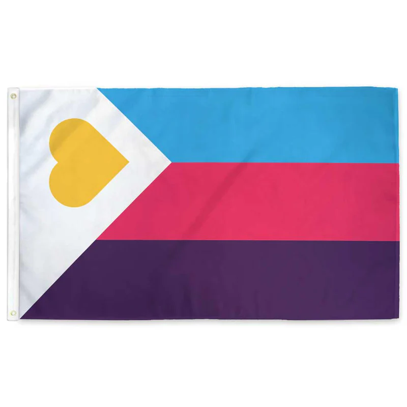
It’s not like there aren’t good pride flags. Like there are AMAZING ones:


Edit:
In case you don’t know what these are: https://flagsforgood.com/collections/pride-flags


I just learned about GSM two days ago here on Lemmy. Now I am learning about GRSM, and while I like both, learning that there is now an additional letter leads me to believe it may go down the same rabbit hole.
Really? I’ve never heard just GSM.
I’ve gone down the rabbit hole and gsm is apparently a common incorrect way to say it. Also a lot of LGBTQ people dislike the term.
Really? Why?
I’m just hearing it for the first time in this thread but my first impression isn’t great. Do you really want a label that brands you as a “minority?” That doesn’t seem like a great first step toward equality.
That was the general consensus from what I read about using the term “minority”. As someone who has been labeled a minority their entire life, the term didn’t strike me as odd from a technical standpoint point, but I can see where it would not sit well for many people.
It’s interesting - the psychology of that. Recently I was answering someone who asked why the US doesn’t have more of a working class movement, and a big part of my answer was that no one in the US thinks of themselves as part of the working class. Even if they are unarguably at the base of the economy, their plan is to get out of the working class, not make it better. Similarly, I can see Americans having a problem accepting themselves as a permanent minority. In other parts of the world this is just a fact of life. Christians in Syria know they will never be a majority. When rebels ousted Assad, one of the first things they said was that they will treat minorities well. Those minorities know who they are. Similarly, Kurds are 15% of Iraq and that is just a fact based on hundreds of years of ethnic history in the region. But in the US, everyone is on their way to something better (at least so we think). Parts of Europe had very formal class systems for long periods of history so there are people who just think of themselves as working class and they stand for workers’ rights. Not so in the US. No one here is working class or a monitory. We’re too full of all the rhetoric about being created equal.
I honestly didn’t even think about it from that point of view. That’s a really interesting perspective. I’ve known instances of Americans going overseas and realizing they are suddenly a minority. They do not like it at all.