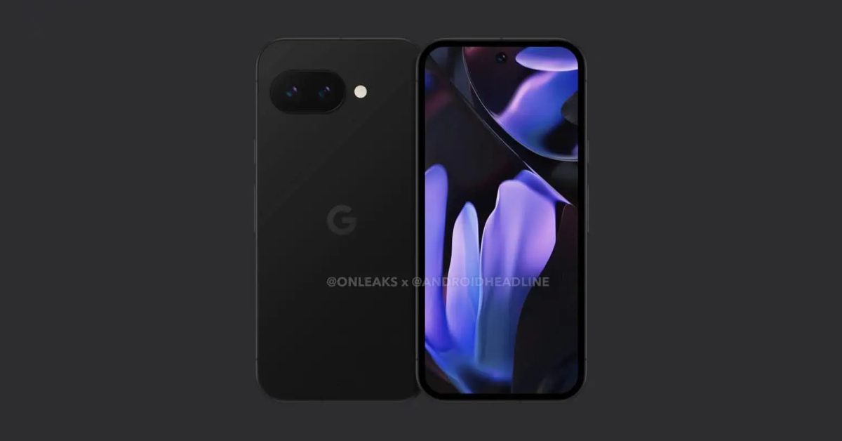
This is the way to go, let’s ditch the camera bump!
By making the whole phone thicker so it has a bigger battery?
Bigger battery right?

Bigger battery!
And headphone jack!
And removable battery!
I personally don’t use the camera much so thinner cameras modules would work for me, however since everybody else seem so obsessed with the camera quality, it seems like a thicker phone is the only way to get rid of the camera bump.
Honestly, if this would make the overall width and height smaller, that would be great. Having a “compact” phone without the minus of small battery
Only if the phone is thicker. Having optical zoom is awesome.
This is the a model, it won’t have optical zoom either way.
I have a pixel 6. All the camera bump, with none of the optical zoom.
7a here, same
Now give it a headphone jack and I can finally replace my 3a XL
Can’t do it, it is too sane and user friendly. Best they can do is further reduce flexibility and add more AI.
And more lenses! Come on, we need to cover the entire back with lenses!
deleted by creator
This is actually a great way to test customers reactions. Just leak your design and see what people are saying. Obviously you still have issues with some people being louder than other, but it’s still a nice way to test stuff without actually selling anything.
Yay for another boring slab with zero distinguishing features!
But this rectangle is newer than the other rectangles, therefore it’s good!
This can IMO be both good and bad. Good if they take the existing design, thicken the body to make it flush with the camera modules and put a larger battery in that space; bad if they use the existing design and make the cameras thinner so that there’s no bump.
But hey, we can’t talk much sense to manufacturers who are happy if we buy a new toy every year…
and an nvme slot and whatever connector laptop wifi cards use.
but we all know the extra space will be for more jank AI.
NVMe in a phone would be something ridiculously inefficient both because of the form factor and the power draw.
While removing the bump/bar thingy isnt a problem, please make it less ugly, it looks horrible.
I’m not trying to disagree, it’s just that it kinda looks like a rounded rectangle? Like what would you want to see to make it more attractive? IMO it basically just looks like an iphone.
Something about the cameras being in a random black rounded off rectangle is strange. You need some separation.


