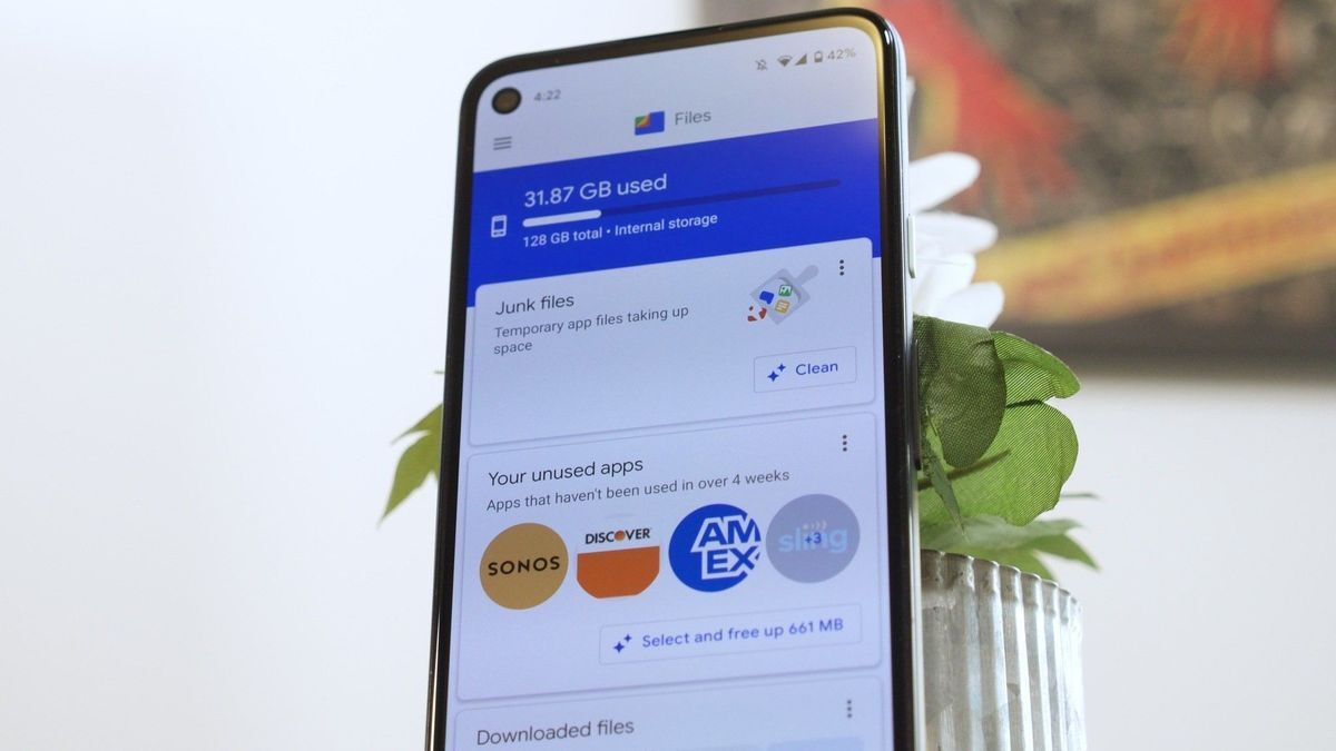
What you need to know
-
Google has redesigned some elements of its popular file management app.
-
Users will be able to view their recent files in the form of a carousel, just like their Memories on the Google Photos app.
-
The new change is seen in the latest beta and some official versions of the app.


That’s because the modern UX designers have spent the last decade trying to unteach everyone the directory structure, so they can sell you their weird, inferior, confusing, bullshit file sorting ideas. I myself sometimes just give up before finding the file.
Yeah. I’m perfectly capable of navigating a file structure, but Android makes it a complete mess. Each app puts files somewhere different, and has a different file picker that is a pain to actually find the file you want.