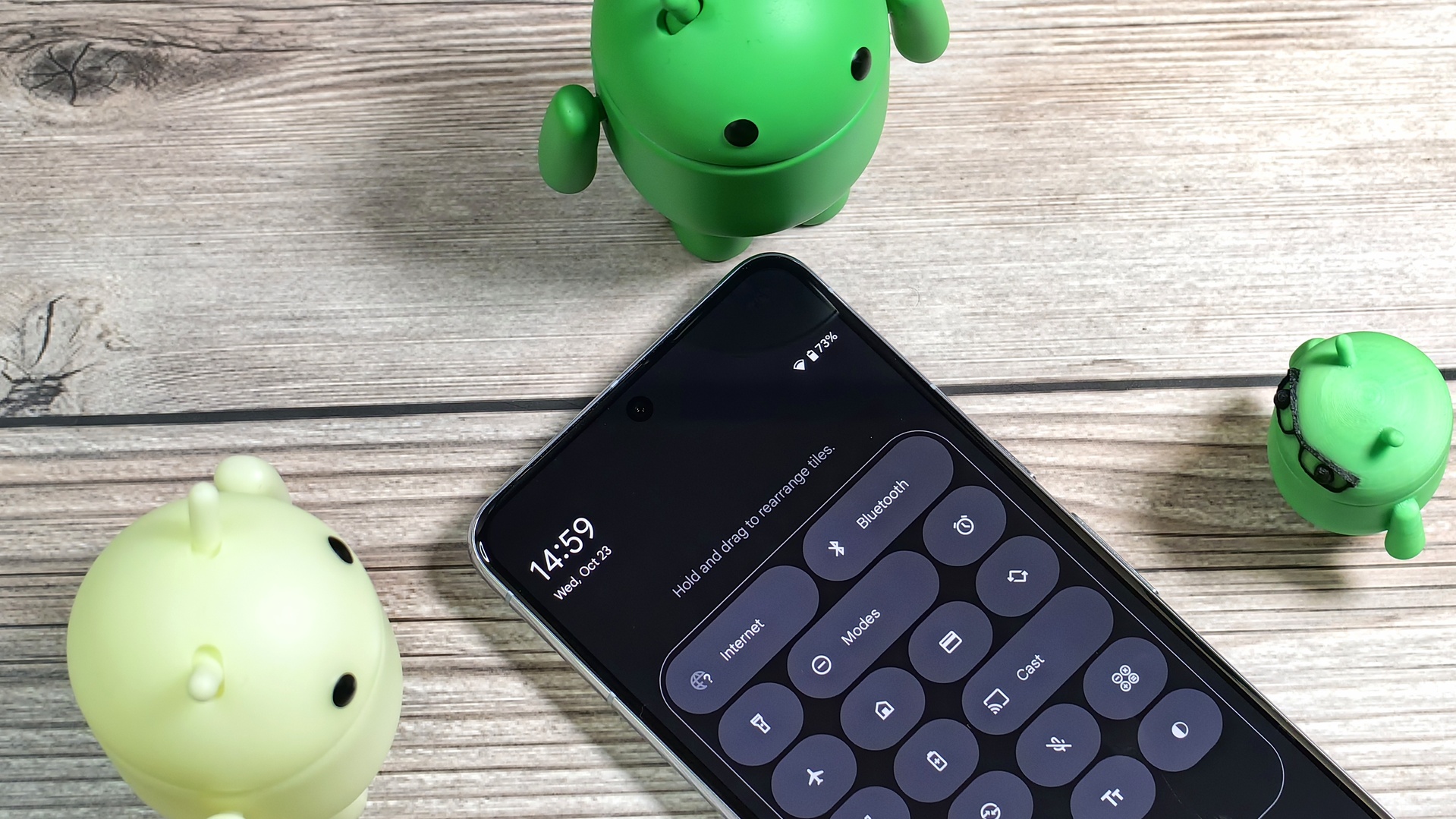
Android 16 may organize Quick Settings tiles into distinct categories like accessibility, connectivity, and privacy. Here’s a first look.
You must log in or register to comment.
Pretty nice. But please change the shape of icon-only buttons to a real circle. icon-only pills always look bad to me
Pills waste so much space, god I hate them
Nothing OS is doing it right by letting you choose between a circle, a pill or a big square.
Reminds me of the Tiles from Win Phone/Win 8


