

You must log in or register to comment.
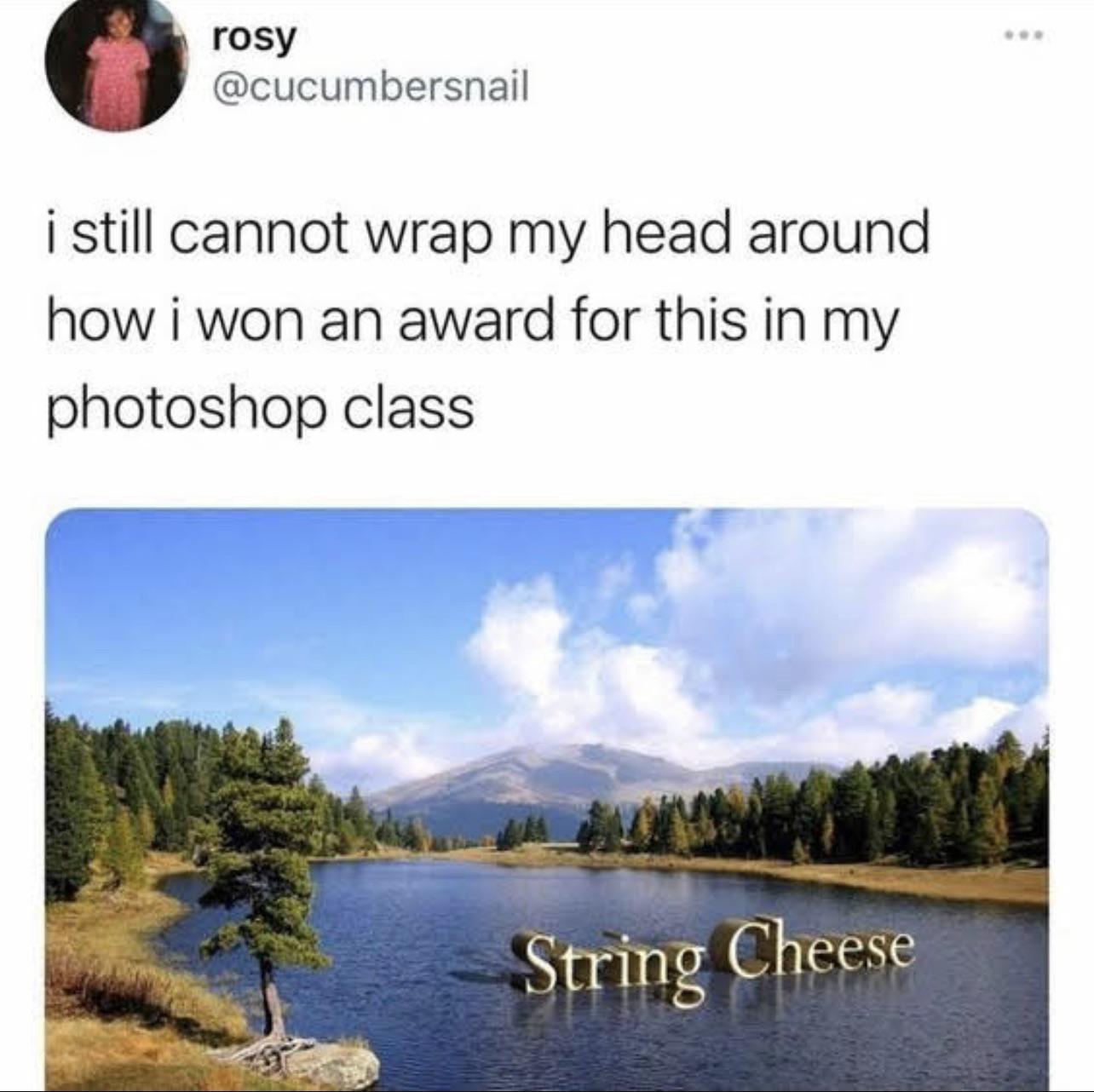
I like that the reflections largely indicate that the text is sitting right on top of the water surface. And then you have this weird, non-euclidean, lowercase ‘g’ that completely demolishes the perspective.
What are you talking about; this image is legitimately quite a good effect for early-days photoshopping. It’s not perfect, but it’s perfectly fine for a student project with an enjoyable result.
The pure audacity of the “g”, which in honesty couldn’t have had anything else done with it without becoming even more jarring and interfering with the readability, only adds to the impact. 10/10