jesusactuallyhateshorses@sh.itjust.works to Climate@slrpnk.net · 3 months agoThis is Fine.slrpnk.netimagemessage-square13linkfedilinkarrow-up1116
arrow-up1116imageThis is Fine.slrpnk.netjesusactuallyhateshorses@sh.itjust.works to Climate@slrpnk.net · 3 months agomessage-square13linkfedilink
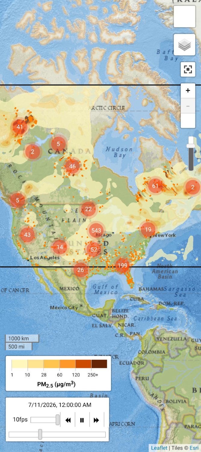
minus-squarejesusactuallyhateshorses@sh.itjust.worksOPlinkfedilinkarrow-up30·3 months agoSmoke from the wildfires.
minus-squarerants_unnecessarily@piefed.sociallinkfedilinkEnglisharrow-up4·edit-23 months agoAre the numbers the amount of fires? And the little orange dots are the fires?
minus-squaresome_kind_of_guy@lemmy.worldlinkfedilinkarrow-up3·3 months agoI believe they’re air quality stations, based on the PM2.5 scale in the lower left
minus-squarerants_unnecessarily@piefed.sociallinkfedilinkEnglisharrow-up1·3 months agoNo, that’s the scale for the colour gradients on the map.
minus-squarejesusactuallyhateshorses@sh.itjust.worksOPlinkfedilinkarrow-up2·3 months agoYes, the dots at this scale are mostly major groups of fires. When you zoom in the dots fan out to give more localized info. I’ve zoomed in on Florida in the image attached to this reply so you can see better. You can see the individual fires have the flames icon.
minus-squarerants_unnecessarily@piefed.sociallinkfedilinkEnglisharrow-up1·3 months agoThat is an insane amount of fires

Smoke from the wildfires.
Are the numbers the amount of fires? And the little orange dots are the fires?
I believe they’re air quality stations, based on the PM2.5 scale in the lower left
No, that’s the scale for the colour gradients on the map.
Yes, the dots at this scale are mostly major groups of fires. When you zoom in the dots fan out to give more localized info.
I’ve zoomed in on Florida in the image attached to this reply so you can see better. You can see the individual fires have the flames icon.
That is an insane amount of fires